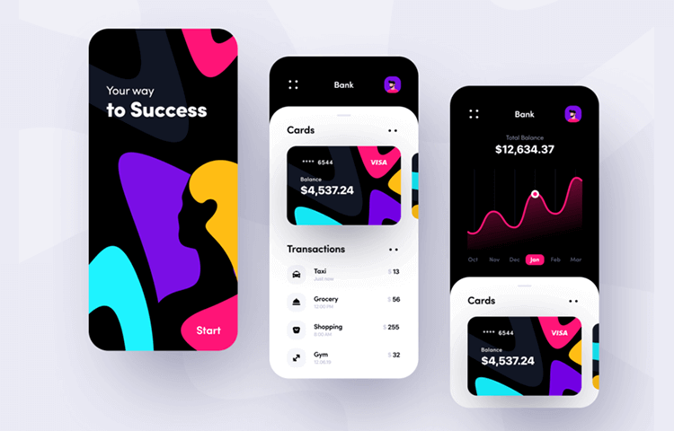
Not sure if it’s possible to create a fun and engaging mobile banking app design? Then let these UI patterns and examples inspire you!
Mobile banking app design is more important than ever. Being able to carry all our financial information around in our pockets was something unheard of a decade ago, but now it might even raise an eyebrow or two if you don’t.
Begin prototyping new banking apps today with Justinmind
As a result, the question facing most banks nowadays is not whether they should invest in banking app design, but how they should go about designing one. Why? Competitivity – every bank worth its bricks and mortar is doing it.
While banks typically competed in the past by marketing their size and prestige, along with trying to offer the best financial products, they’re now faced with a new challenge: creating a mobile app UI design that keeps customers happy.
Hence, when it comes to mobile banking app design, usability reigns supreme. When the quality of services they offer doesn’t vary greatly from the competition, having a usable app may be their winning feature. That means designers have to rely on a prototyping tool that allows for constant testing and swift changes.
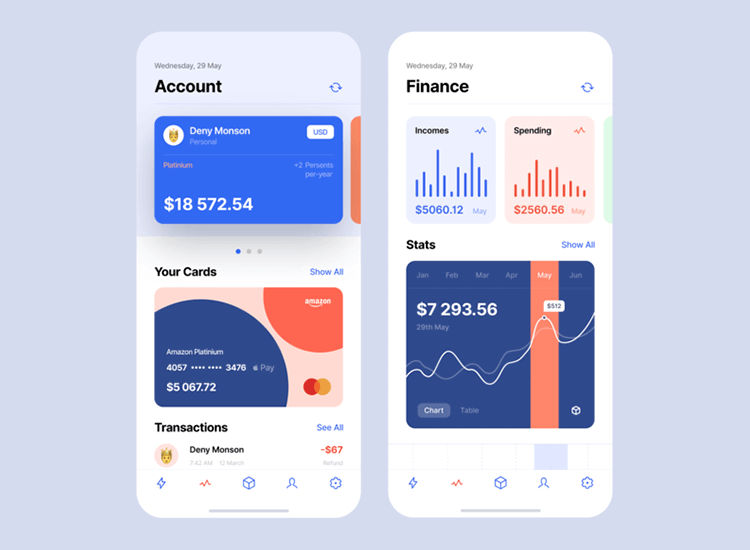
To further illustrate the increasing importance of banking app design for financial institutions, we just need to look at the precipitation of app-based banks over the last few years. Sometimes referred to as “challenger banks”, they depict this newfangled competitiveness in mobile banking app design. Mobile banking has become so important that these financial entities are based on apps alone, with no physical presence.
So, if you’re looking to create a banking app design that’s likely to keep current banking clients satisfied or reel in new users (customers!), this post is for you. Read on for our list of 10 essential UI design patterns for banking apps, along with tips on how to achieve the best UI design.
Looking for a broader type of inspiration? Discover our guide to skeuomorphic designs.
- 01. Heuristics and trendy aesthetics: Revolut
- 02. Helpful tips and virtual assistants: Bank of America
- 03. Cards instead of lists: N26
- 04. Vertical scrolling and progressive disclosure: Chase
- 05. Landing pages with statistics: Starling Bank
- 06. Visible and swipeable account cards: Lloyds Banking Group
- 07. Gamification and rewards - Monese
- 08. Maps (spending locations and nearest ATMs): Monzo
- 09. Useful notifications: CreditWise (Capital One)
- 10. Social banking keyboard: Itaú Unibanco
A huge factor in good usability is great UI design. If your UI is intuitive and easy to navigate, it will reduce cognitive load on your users and help them get things done faster. If your banking app design manages to achieve this, you’re on to a winner.
Note: For more information on how to create generally intuitive UI designs, check out our prototype examples page.
On the other hand, if a bank branch has customers coming in regularly to ask how to use certain features of the app, then it’s clearly due to poor banking app design and bad usability. This type of problem has to be fixed, and fast.
Defining your user base and carrying out the appropriate user testing techniques before you begin your banking app design is crucial. Obtaining regular feedback from your users during the design process is equally important.
Your target users will help you define which UI patterns and features your banking app design really needs.
When it comes to banking app design best practices, there are some rules you can holistically apply across every app category, while others are more sector-specific, like security features. These patterns are a great way to ensure you create a product that respects and reflects key UI design principles.
In this list, we’ve included the UI patterns that work well for banking app designs of all kinds. Let’s take a look at the design qualities of some of the best mobile banking apps out there on the market.
The first and foremost aspect that’s important in modern banking app design is a friendly, appealing UI that aims to add clarity and reduce cognitive load.
Modern banking app designs are ditching the typical, prestigious, somber graphics and colors of traditional banking apps in favor of a minimalist, colorful or even playful, UI design. Choosing an appealing color scheme that reflects your brand is a great way of achieving this.
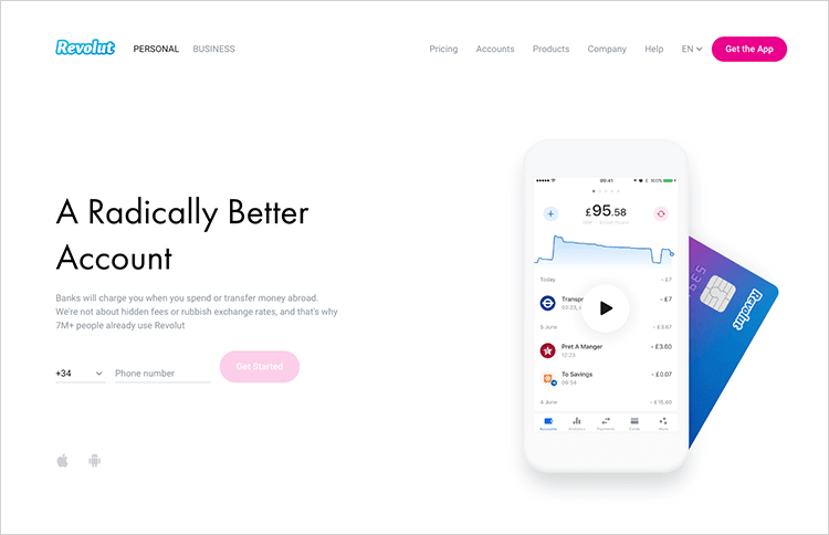
One great example of a mobile banking app design that uses a trendy UI design and color scheme is that of challenger bank, Revolut. This app takes advantage of its purple, pink, white and blue branded color scheme to add contrast and clarity throughout the app while providing consistency throughout each page.
Revolut uses various colors and color shades to differentiate currencies, accounts and options, along with loud pink color for call to actions. It also uses various shades of grey scale to distinguish important text and explanatory paragraphs.
Another neat feature, and a characteristic of Nielsen Norman Group usability heuristics, is that it displays your debit and credit cards as they are in real life, letting you swipe horizontally to choose which card account and settings you want to view.
Creating an intuitive banking app design can be tricky. Guiding a user through the initial learning curve can be even trickier, but if done right, can also pay off tenfold by bumping usability through the roof.
Firstly, there are some pitfalls to avoid. Many apps will think nothing about cluttering the UI with “hints”, “suggestions” and “tips”. This clutter can overwhelm the user or distract and frustrate them. Many receive unhelpful tips that they could have figured out themselves. Sometimes it’s hard to remember all the tips in an app and other times, it’s best to let a user learn by doing.
Afterall, a good banking app design should be intuitive and need minimum explanation. So how do we get the balance right? The trick seems to be doing it at the right time, or giving the user the option to find out more information about a feature or element of the UI with inline tips.
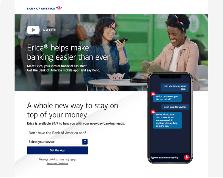
However, Bank of America (BOA) came up with a unique workaround for their banking app design. They guide their users with a virtual assistant, Erica. In a similar fashion to iOS’s Siri, Erica asks the user what they want to do as they log into their app and guides them through it. BOA users can ask Erica for anything, whether it’s viewing their checking account balance or making a transfer.
This optional feature is a great example of how to guide a user through your app’s UI without overwhelming them with tips they might not remember or cluttering their screen with useless information. You can read more about creating something similar in our post on voice user interfaces.
A great way to improve readability in your banking app design is to convert long lists of options to cards. That is, instead of having a vertical list of text links, use cards with text and symbols that your users can tap on.
These UI cards can be grouped in a way that looks like they form a set of panels or a grid. Arranging options on cards in this way guides a user’s eyes more easily. It makes each option more visible, helping the user find the feature or service they’re looking for faster, thus saving time and improving usability.
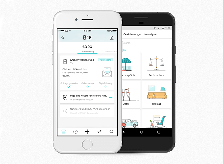
A good example of using cards to achieve this end is the challenger bank, N26’s mobile banking app design. In their insurance section, each product is displayed as a card, instead of a vertical list. Each card has microcopy providing a description and an image.
The result is a more simple UI design. It makes the options readable and the design friendly. For us, it’s a win-win all round.
Begin prototyping new banking apps today with Justinmind

Mobile banking apps are often data-heavy, like dashboard designs. They contain detailed information about a users’ accounts and debts, along with the services on offer to them. Just logging into your banking app to check out your finances could lead to information overload pretty quickly. Unless it’s done right.
Revealing information in small segments makes it easier for the brain to process more information. This is also evident in form design, where breaking up questions into smaller segments can actually help a user fill it in more quickly and accurately.
This technique, known as Progressive Disclosure, is paramount to ensuring that your users aren’t overwhelmed by a sudden cascade of information.
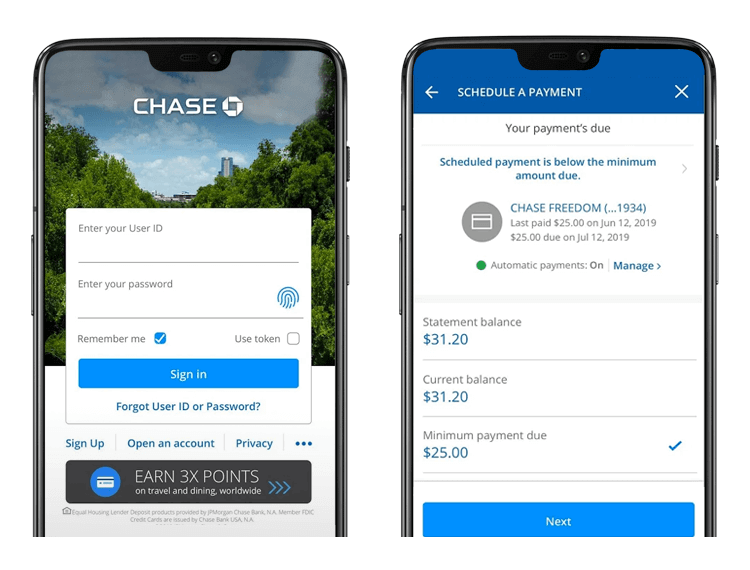
Chase is a great example of incorporating the rule of progressive disclosure into mobile banking app design. The app’s homepage presents the user with a series of cards that display nothing but the name and balance of each account. The user can then display more information about each account, such as transaction statements, by tapping a card.
Another nice touch is that users can arrange their accounts into the order of which ones they want to show up first on the homepage. They can personalize the UI by simply dragging and dropping them into place.
We also like the way the accounts are vertically stacked as opposed to horizontally, where some balances would otherwise be hidden from the user’s view. The button states are also very helpful.
An important pattern to consider in banking app design, is to give the user access to screens that display insights about their finances. These are usually statistics based on things like spending habits, debt settlement records and savings.
Challenger apps are more likely to offer these in-depth analyses about a user’s spending habits. This feature helps users to feel more in control of their finances and is worth including in any banking app design.
Many challenger apps use a simple UI pattern to break down complex financial information. This means that users who aren’t financial experts can see a breakdown of their expenses, credit card debt and credit scores in a way they understand quickly and clearly, with a minimum learning curve.
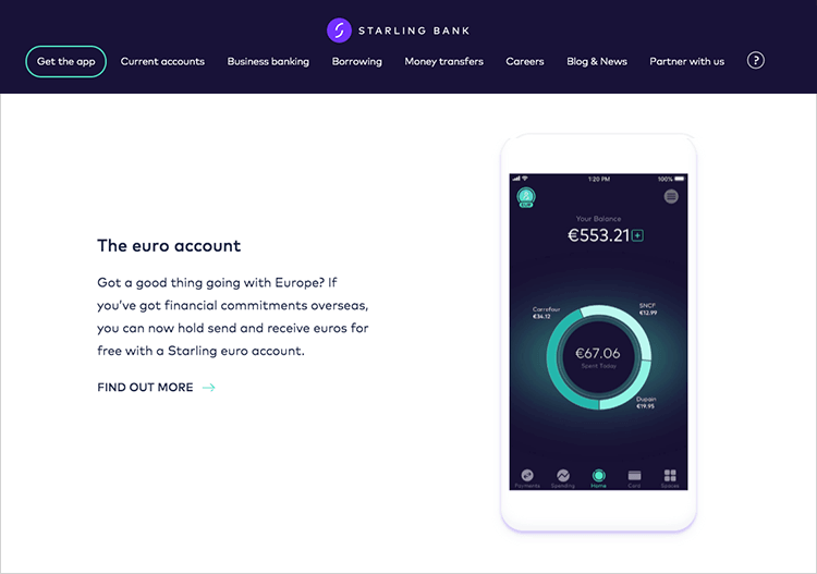
Starling Bank is an excellent example of how to integrate personal finance statistics into a mobile banking app design. Financial statistics, which might otherwise be interpreted as boring or intimidating to non-experts, can convey useful insights in a way that’s easy on the eyes in this app.
Starling’s statistics UI pattern includes a landing page with the balance clearly depicted at the top, with an overdraft display and a simple chart with a breakdown of expenses. All on one screen!
One of the main trends that we’ve been seeing that users really appreciate in modern banking app design is being able to immediately see the balances of all their accounts on the landing screen. This is because people like to check the most important information first.
Lloyds Banking Group is a marvellous example. Their banking app design allows users to see their main primary checking account balance displayed on a card as soon as they log in to the app.
The user can then easily swipe to see other accounts. The app manages to make use of what little screen real estate is available to achieve this without cluttering the UI.
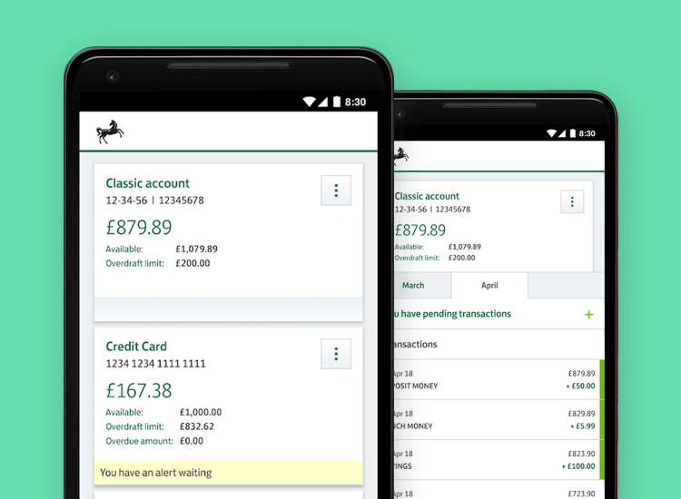
But there’s another neat feature making this banking app design a hit with users. That is, the user can easily see the balance of each account when they transfer money from one to the other.
Lloyd’s banking app design also makes it easy to see pending payments on mortgages, loans and credit accounts, in addition to letting the user open new accounts in the app. Now that’s what we call good usability!
Gamification is a technique that can keep users engaged and have them access your app for more than just getting things done. It can also help your app become more popular as users talk about it. And if your gamification feature gets multiple users interacting with each other, even better!
We like how challenger bank, Monese, found a UI solution to incorporate a gamification feature into their banking app design. It’s a novel take on banking apps that could set a benchmark for boosting banking app ux.
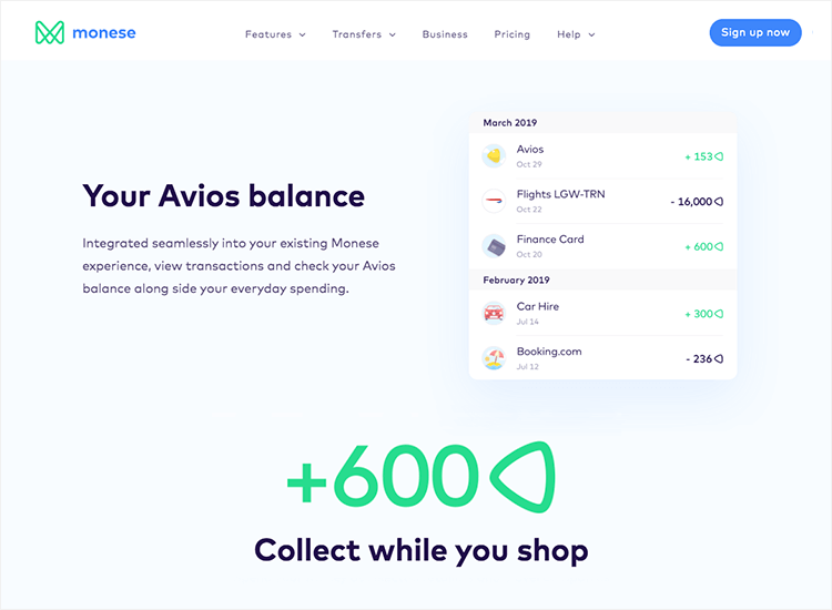
For this feature, Monese teamed up with Avios, which is a common points system shared between British Airways Executive Club, Vueling Club, AerClub, Meridiana Club and Iberia Plus.
The idea is that Monese users can on any Avios partner brands such as JustEat or John Lewis using their Monese card. By doing this, they can earn Avios points, which they can even transfer to other users.
Begin prototyping new banking apps today with Justinmind

Maps are very typical in mobile banking app design and they’re often used for one sole purpose: to locate the nearest ATMs of that bank, relative to the user’s position. This is a handy feature – it is slightly easier to search for the relevant ATM’s on your mobile banking app than to find them on Google or Apple maps. But they’re hardly a unique pattern in mobile banking app design.
Enter another challenger bank to shake up the scene: Monzo. This mobile banking app brings a feature that, until recently, has been unheard of in mobile banking app design – mapped transactions.
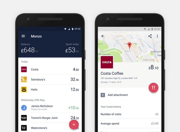
This feature allows users to not just see a list of recent transactions with the name of the payee and the amount. It actually displays on a map where exactly each transaction occurred. Many users can probably attest to having been in the following scenario:
You make a transaction that doesn’t show up in your statement of transactions until a few days later. When it does, the payee name doesn’t match the name of the shop, causing confusion and resulting in your not being able to recall that transaction with ease.
Monzo’s solution of showing the transaction location on a map offers the user a solution by helping jog their memory, leading to an “I remember that place!” moment. The interesting part is a “something wrong? Tell us!” link that the user can click on if they don’t remember a transaction from the map or if their card has been stolen.
It’s a thumbs up from us for a great mobile banking app design pattern.
Notifications are tricky territory as users can get frustrated when bombarded with a ton of them. This is especially true when such notifications don’t help them to achieve their daily goals, or are just nice-to-knows that happen too often and start to become a nuisance.
However, if used properly in banking app design, notifications can offer the user a personalized experience and help them in their daily lives. It’s also a magnificent way to build trust with the user as they know they’ll always be informed and kept up-to-date about the information that matters to them.
Allow your users to select what they want to get notified about. Be it card or bill payment notifications, credit score or loan application updates, if you let the user decide, you’re on to a winner.
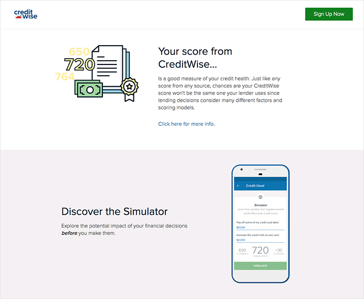
Capital One does a really good job of this with its CreditWise app. It has a useful notification feature, which shows they listened to what their users wanted. An individual’s credit score can be a major concern at the back of their mind. It can be something that they have an emotional connection to and it’s an important goal in their lives.
Therefore, this is a great example of notification that could help keep them constantly in the loop about something that might otherwise keep them awake at night. In addition to this, seeing a notification that they’re one step closer to securing that next loan offers outstanding potential for user (and customer) satisfaction.
Another nice touch is that CreditWise only sends this type of notification once a day. Sometimes less is more, at least with mobile banking app design.
Sometimes to make a banking app design really stand out from the crowd, you’ve got to innovate, and that’s exactly what Itaú Unibanco have done with their new keyboard.
The Itaú Keyboard is a feature of their mobile banking app that’s designed to be used within WhatsApp or Messenger, via Gboard. It lets users send transfers while texting their friends, family or colleagues and provides a familiar environment for the user to operate in. It lets them request or make a transfer immediately without having to leave their WhatsApp conversations.
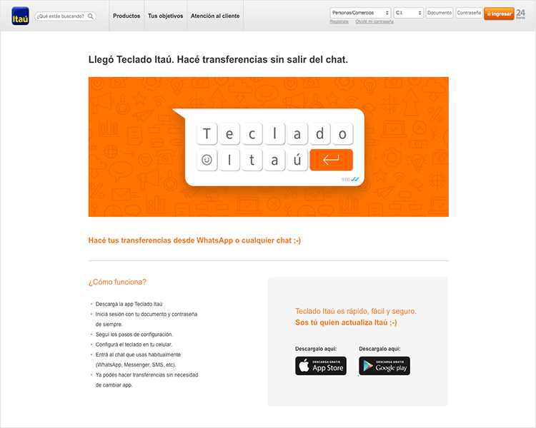
This design feature allows users to conduct a large portion of their financial activities in the familiar background of their favorite messaging apps.
By letting users conduct their financial activities in familiar apps, Itaú is aiming to make the payment and transfer feature of their banking app more intuitive, natural and comfortable for their users.
Creating a mobile banking app design that your users will not only find useful, but will enjoy using is no easy task. Nonetheless, with regular user feedback and the right amount of innovation, any mobile and web design is possible.
Tip: For more inspiration on mobile and website design, check out these inspiring web and mobile wireframe examples.
Here are some important points to remember when designing your banking app’s UI:
- Identify your main users, e.g. young Millennials and Gen Zers
- Use progressive disclosure to reduce cognitive load
- Use a tasteful, contrasting color scheme that matches your brand
- Make the hard facts easy to find, e.g. account balances and pending payments
- Listen to your users throughout the design process
We hope this list has provided you with some inspiration towards your next mobile banking app design!
PROTOTYPE · COMMUNICATE · VALIDATE
ALL-IN-ONE PROTOTYPING TOOL FOR WEB AND MOBILE APPS
Related Content
 UI design examples that bring some serious inspiration. From parallex scrolling to delicate animations - this list has it all to get you inspired!8 min Read
 The perfect web design portfolio is all about presenting yourself in the best light. Check out these guidelines, examples and practical templates!8 min Read
 Creating effective surveys is key to getting valuable feedback. This guide shows you how to plan your survey, write easy-to-answer questions, and design a user-friendly interface. We've covered everything from setting clear goals and knowing your audience to structuring questions and making the survey look so great that people will love to answer.23 min Read
