Single page design v multi-page websites– everything you need to help you choose the right design for your site’s content
Deciding between single page and multi-page design can be tricky. With mobile and social media browsing on the rise, simple, speedy and responsive single-page websites are among the most popular web trends to date. On the other hand, multi-page websites, defined by traditional navigation flows, are well-known and trusted by users.
Design one-page websites (and multi-page as well ;-)

It’s a tough call. The best way to choose between single page and multi-page design is to consider your site’s content and navigation flow. Is your site’s content quick and easy to browse, or is there lots of content that needs to be strategically placed for users to find? With a content-first approach to your web design, you’re more likely to pick the right navigation system for your website.
And if you’re still hazy on whether single page or multi-page design is the way to go for their web design, this post will help you weigh up the pros and cons of each. Read on to find the right navigation flow for your site’s content. Have your favorite website prototyping tool at hand, just in case inspiration strikes!
A one-page and single-page website are the same; you might see it referred to either way. A single or one-page website is simply a website that only contains one HTML page. There are no additional pages, such as an About, Features or Contact Us page.
As Awwwards explains, content on single page websites is fully loaded in the initial page, making the experience more continuous and fluid for the user. To navigate to different destinations on a single page website, users click navigation links that allow them to jump to destinations on the page, or scroll down the page to reach different sections of content.
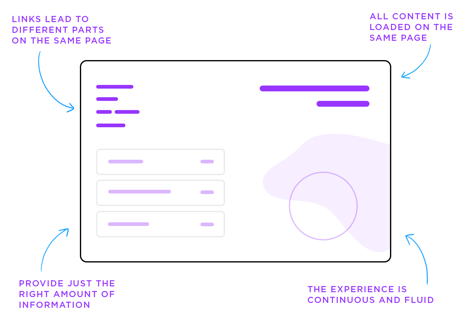
Single page websites aim to provide just the right amount of information for a user to make a decision and act on it. This is why single-page design is often used for landing pages, portfolios and event-related websites. This minimal web design removes any unnecessary noise from the interface, focusing the user’s attention on the most important content.
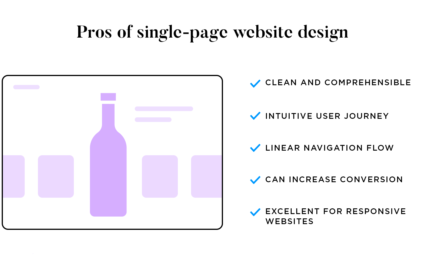
Why opt for a single page design for your website over a multi-page design? For starters, successful single page websites are clean and comprehensible. A single page website, that splits content into small chunks and removes UI clutter, is easy for users to digest.
Single page design also contributes to an intuitive user journey. With no additional pages, visitors enjoy a linear navigation flow – which tells a story with a clearly-distinguished beginning, middle and end.
Another advantage of having a straightforward navigation design is that there is usually only one action to be taken by the user. Studies show that having a single page can lead to increased conversions (>37.5%) than multi-page sites because users begin the process sooner and move through it more quickly, with nowhere to get lost or distracted by another offer.
Did we mention single design great for responsive website prototypes? With small amounts content (and all fitting on one page), you can adapt single page websites to smaller screens and devices easily and consistently. Plus, scrolling is an easy and natural movement for touch screen mobile devices.
But that’s not all – there are some interesting benefits for designers too. For instance, with only one page, there are zero screen-to-screen links and much less content than on a multi-page design. This makes single-page web design generally easier to implement, iterate and maintain. Hurray!
Design one-page websites (and multi-page as well ;-)

But it’s not all roses. There are a few reasons why single page design might not be right for your website.
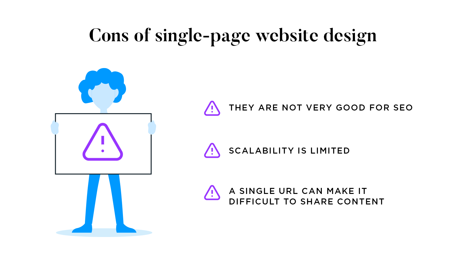
Single page websites aren’t big on SEO (Search Engine Optimization). In fact, they could hurt your chances of ranking with Google and result in decreased conversions and user engagement. With so little content, target keywords often get neglected on single page sites. Moreover, siloing (the practice of structuring your website by main areas of interest to demonstrate authority in those areas) is a no-go. The good news is that there are workarounds, such as using the expandable div to include descriptions and additional imagery.
Additionally, the single page website isn’t the ideal candidate for a growing brand, as its ability to scale is limited. As we’ve already seen, single page websites tend to have a narrow focus and are therefore not well-suited for websites that require large, complex, and/or varied use of content. So even if you’re operating a small site, consider where you’ll be some years down the line and keep that in mind when choosing between single and multi-page design.
Finally, consider the fact that you’ll only have one URL to work with. This might not seem like too big a problem, but how about when you want to share something on your site with the social media community or track a link in Google Analytics? Every link counts!
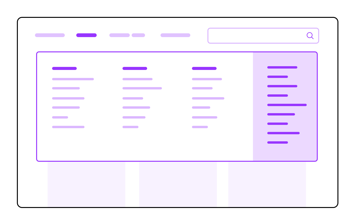
A multi-page website contains multiple pages and subpages within a menu. Unlike the single page website, the only way to navigate to and view pages in multi-page design is to click on the links within the menu.
The multi-page design is well-suited to nearly every type of project. Examples of multi-page web design can be found in eCommerce sites (such as Amazon), dashboard designs (such as Atlassian) and eLearning sites (such as Lynda).
There are three main advantages of the multi-page over the single page website.
Firstly, multi-page design offers unlimited scalability. Create as many pages as you like and expand the navigation system as needed. For instance, swap your top navigation bar for a custom mega menu with a search bar for endless navigation possibilities. Remember, the type of navigation design you opt for will depend on the depth of your website goes, the more a traditional navigation will struggle.
Secondly, the navigation flow of a multi-page site is easy to follow. This type of website has been around since the 90s, which means that most users are familiar with it, and often expect to find multiple pages on sites. As long as your website’s navigation flow is easy to follow, you’re smooth sailing with a multi-page design.
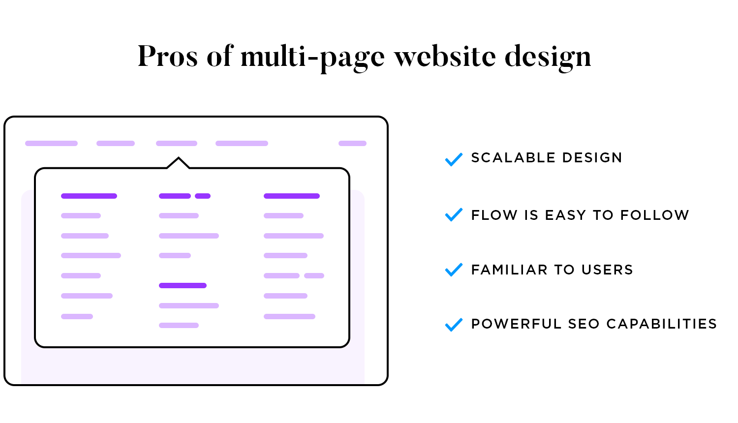
Finally, sites with several pages have powerful SEO capabilities. We’ve established that multi-page sites are more likely to have larger amounts of content than those with a single page. And although the SEO potential of each website heavily relies on your digital marketing strategy, just having the content potential to optimize your SEO is a great start. Learn more about the importance of SEO on your website here.
Looking to study the classic patterns designers rely on? Check out our guide to UI patterns.
Design one-page websites (and multi-page as well ;-)

Multi-page websites seem to have worked for us up until now, but there are a few disadvantages to take into account.
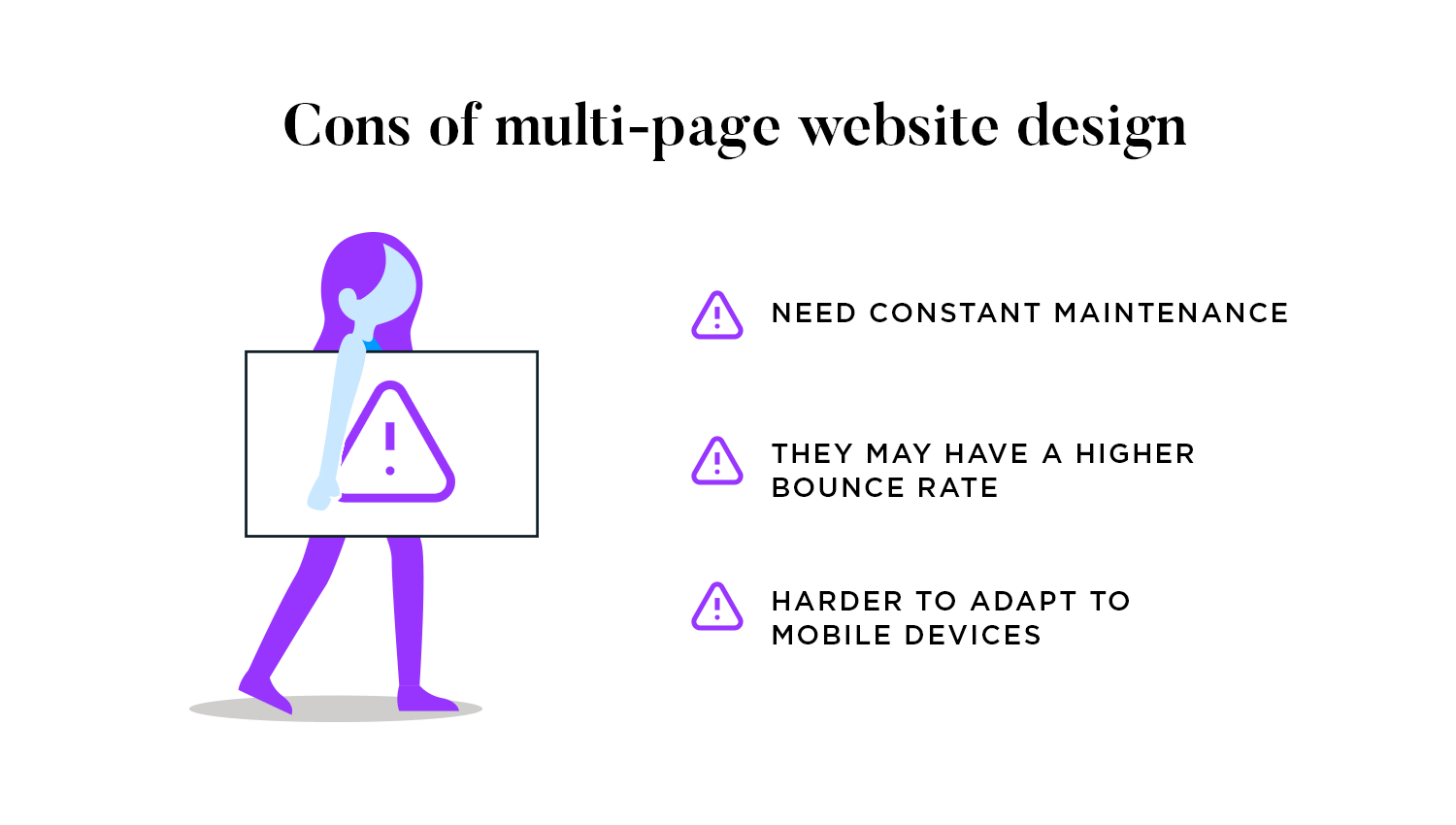
For instance, consider how you’ll manage regular updates to your site. Don’t forget that all that content needs to be maintained by the design and content teams. When considering whether to design a one-page or multi-page website, you need to think about whether having lots of content is cost-effective.
As Undsgn says: “updating and maintaining a single page is easier than taking care of several – you can’t argue with math!” And remember that low-quality or under-optimized content is just plain bad for business.
Another thing to take into consideration is your site’s bounce rate. Websites with heavy amounts of content are often slow-loading, distracting, and can cause users to bounce– according to Search Engine Journal. And although not every multi-page website is content-heavy, with all that room to scale, it’s something to look out for.
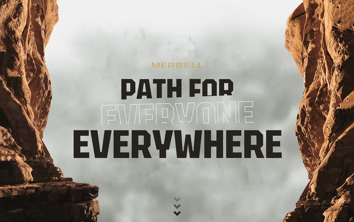
Here are 20 awesome examples of one-page websites with fantastic design.
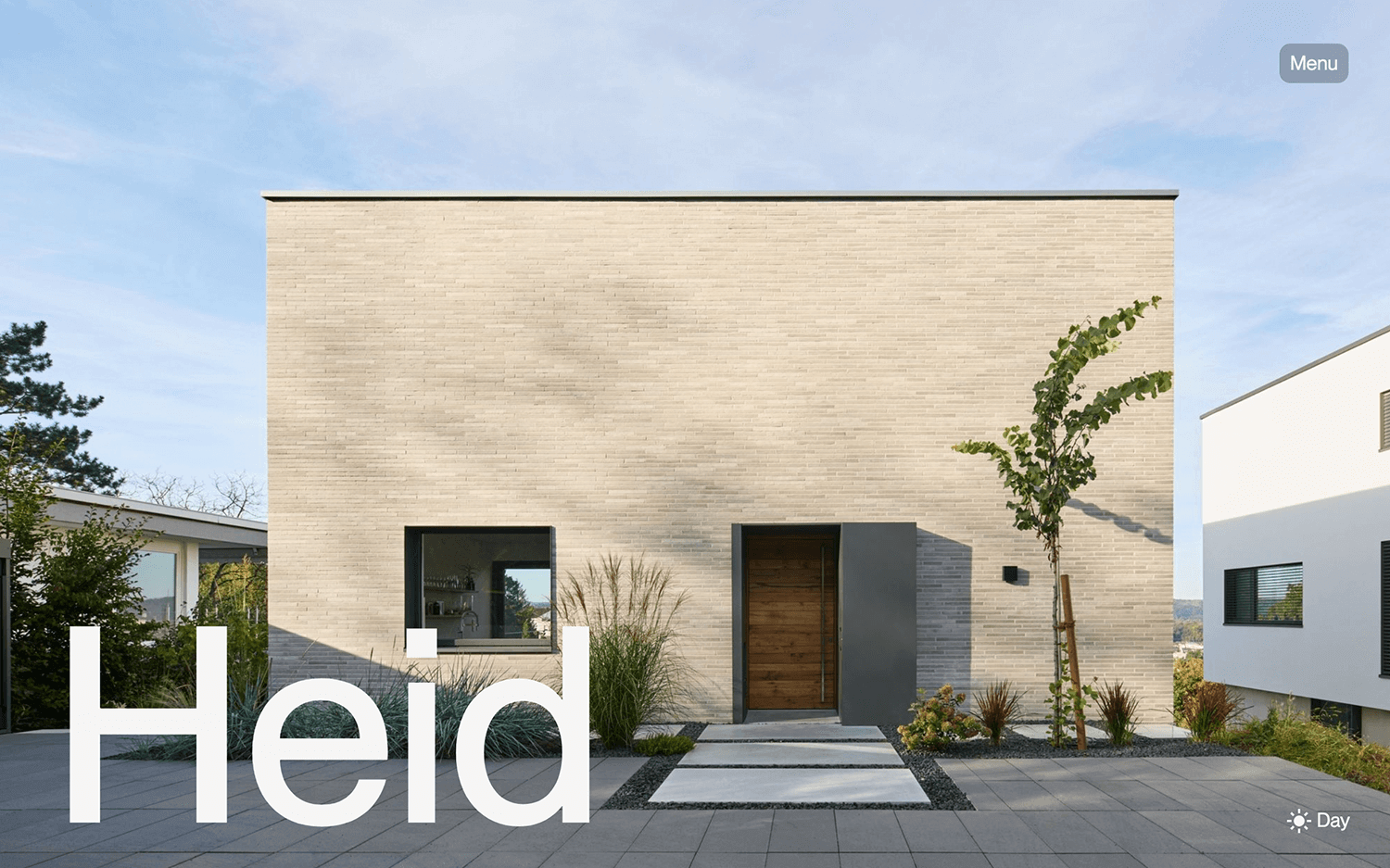
HEID is a modern one-page website design that uses high-quality pictures and short text to get its message across. Smooth scrolling and interactive parts make it fun to explore. The layout is well-organized, so you can find everything you need easily.
This one-page website shows how effective a single-page design can be, offering ideas for those thinking about one-page vs multi-page websites. It’s a great example to look at if you’re considering one-page website templates.
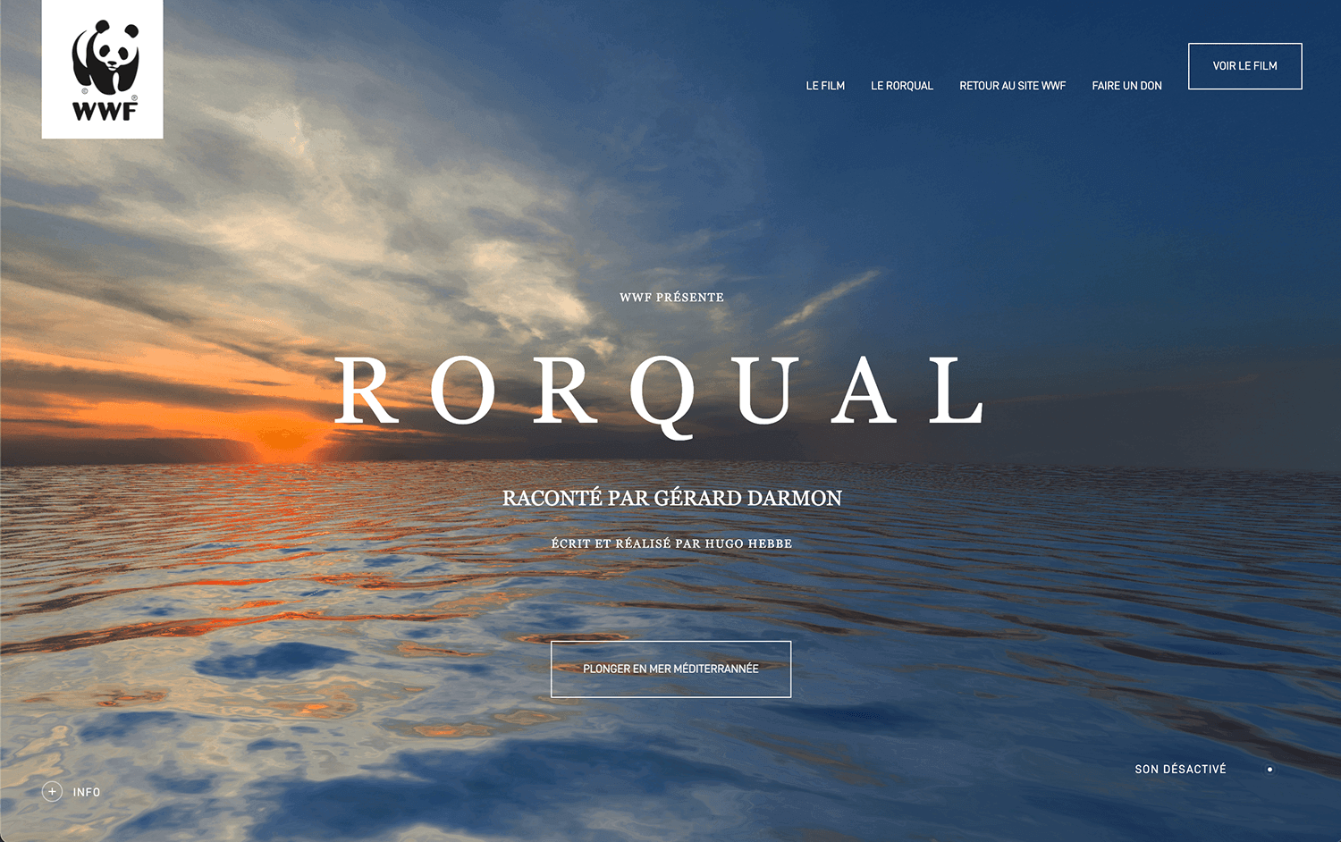
Rorqual is a fantastic example of a one-page website that proves you don’t need tons of pages to be successful. The website uses smooth transitions and interactive features to keep visitors engaged as they explore.
Everything is well-organized and laid out clearly, making it easy to find the information you need. Rorqual is a great source of inspiration for anyone considering a one-page website, demonstrating its effectiveness and potential.
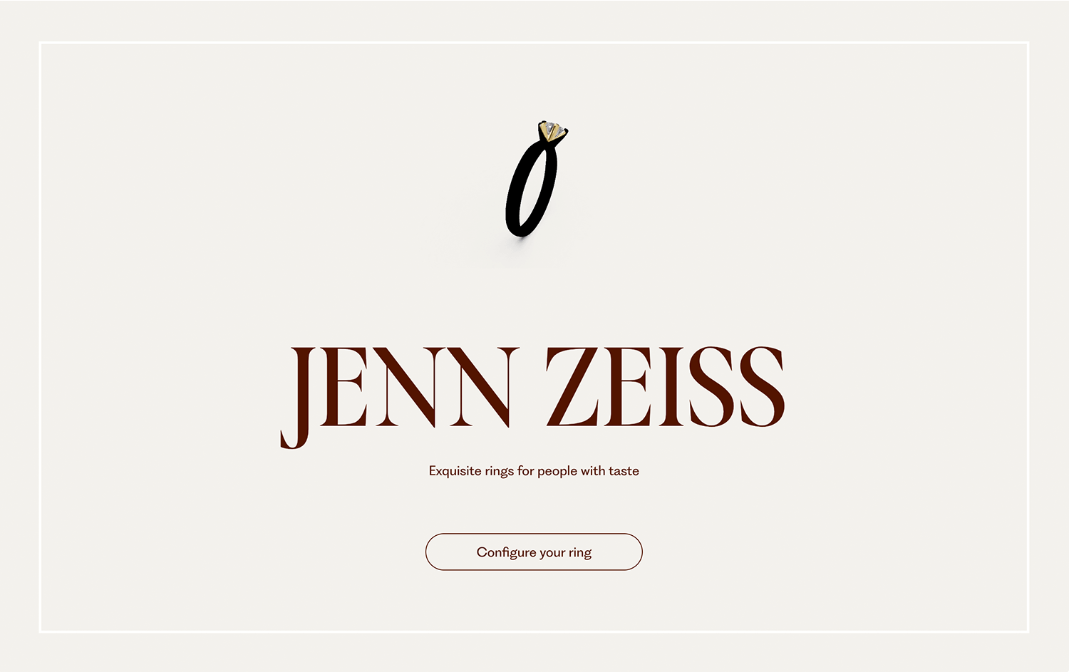
Jenn Zeiss’s website shows how a portfolio can look great on just one page. Smooth transitions and interactive features keep visitors interested as they explore. The layout is well-organized and easy to navigate, making it simple to find everything you need.
Jenn Zeiss’s site is a fantastic example for anyone thinking about a one-page website, showing how effective and appealing this design can be.
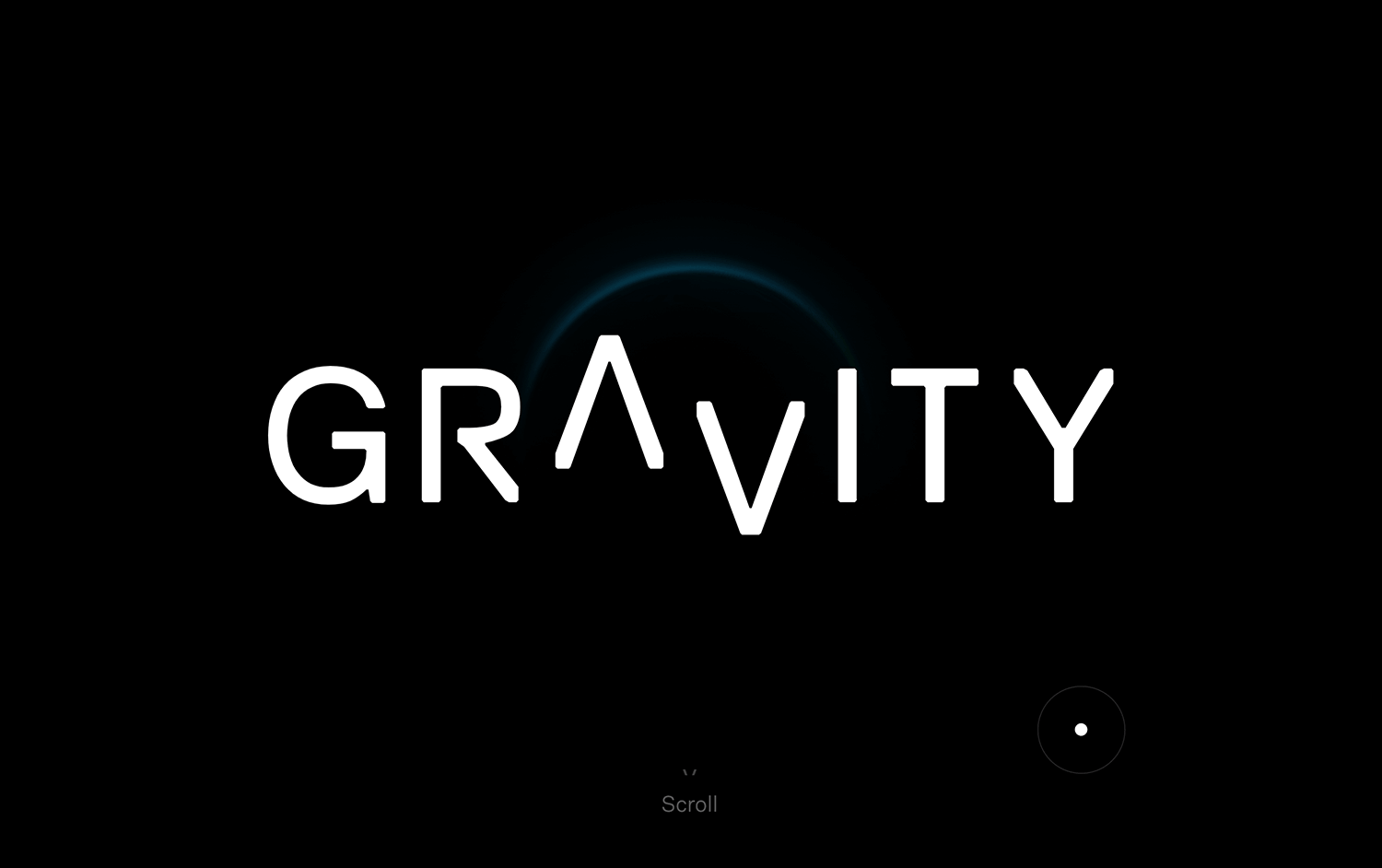
In this example, we can see how a business can effectively use a one-page design. Gravity’s website features smooth transitions and interactive elements that keep visitors engaged as they scroll through the content.
Everything is well-organized and clearly presented, making it easy to find all the information you need. Gravity’s site is a great source of inspiration for anyone considering a one-page website template, showcasing the effectiveness and potential of this design approach.
Khow’s website is a great example of a one-page design done right. The site grabs visitors’ attention with its smooth transitions and fun interactive features. The layout is clean and well-organized, making it easy to find all the information you need.
Khow shows how a one-page website can be both attractive and functional, offering lots of ideas for anyone looking at one-page website templates.

Dopescope has a really cool approach to single-page website design. With bold colors and dynamic visuals, it keeps visitors hooked. The smooth scrolling and interactive elements make the site fun and easy to explore.
Everything is well-organized, so you can quickly find what you’re looking for. Dopescope is a great example of how creative and effective a one-page website can be, offering plenty of inspiration for those considering this design style.

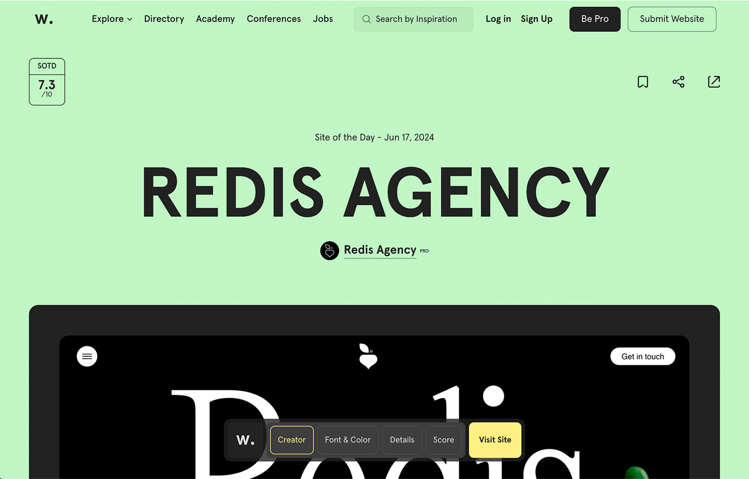
The sleek design and smooth animations of Redis Agency’s one-page website is another great example that keeps visitors interested. The interactive features and clear layout make it easy to navigate and find information.
Everything is well-organized, making the site both attractive and user-friendly. Redis Agency shows how a well-made single-page website can be both engaging and effective, perfect for anyone thinking about using a single-page design.
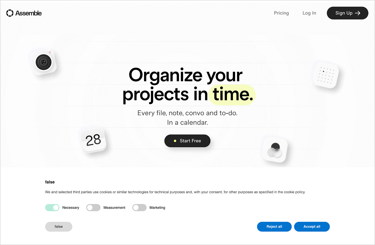
We chose Onassemble because it brilliantly showcases how a one-page website can be both visually striking and highly functional. The site uses bold visuals and smooth transitions to capture visitors’ attention.
The interactive elements and clear layout make it easy and enjoyable to explore. All is pretty well-organized, so finding the information you need is a breeze. Onassemble is a great example of how creative and effective a one-page website can be, providing plenty of inspiration for those considering this type of design.
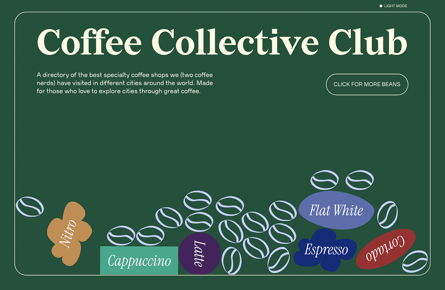
We couldn’t miss including this one because it is an amazing example of how fun and engaging a one-page website can be. The site uses warm colors and inviting images to draw you in. Smooth scrolling and playful interactive elements make it a joy to explore.
Everything is laid out clearly, so you can easily find all the information you need. Coffee Collective shows how a single-page website can create a cozy and enjoyable experience, perfect for inspiring anyone thinking about this design style.
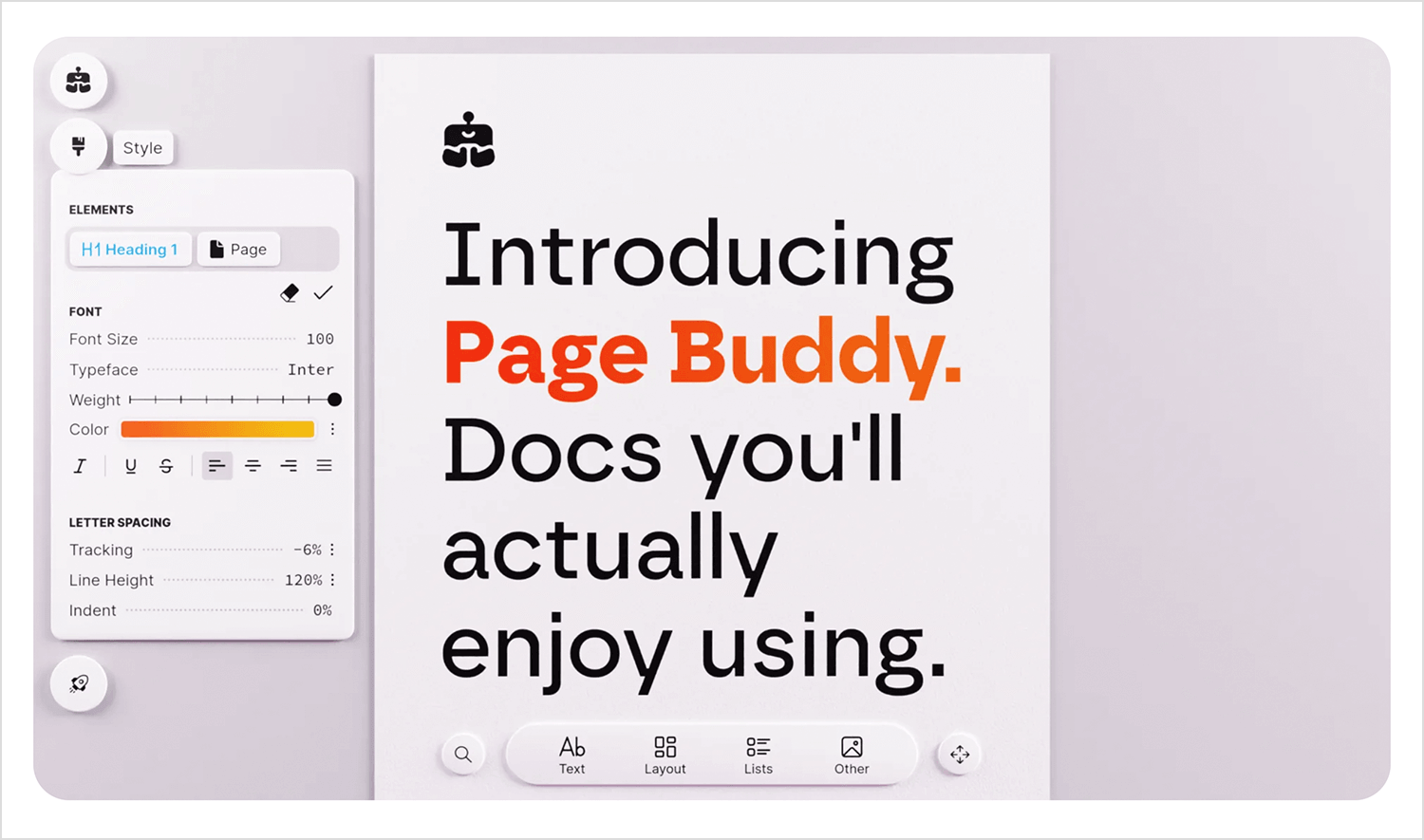
PageBuddy is a one-page website we just had to include. Its clean design and smooth animations create an engaging experience from the start. The interactive features are well-integrated, making it simple to navigate and find what you need.
The clear and organized layout keeps everything user-friendly and attractive. PageBuddy is a great example of how a one-page website can be both functional and visually appealing, providing plenty of ideas for those looking into this design style.
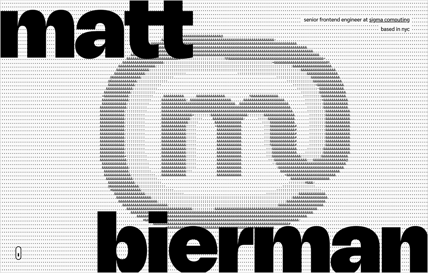
Bierman.io is a smart example of how a one-page website can look great and work well. The site features a clean, modern design with smooth scrolling and interactive elements that keep visitors interested.
The layout is simple and well-organized, making it easy to find all the important information. Bierman.io shows how a single-page website can be both stylish and easy to use, providing inspiration for anyone thinking about this type of design.
Bizarro stands out with its creative one-page design. It uses bright pictures and surprising layouts to grab your attention right away. Exploring the website is fun because it has cool features and smooth transitions between sections.
Even though it’s different, everything is well-organized and easy to find. Bizarro shows how a one-page website can be both eye-catching and clear, inspiring anyone looking for a unique approach.

Zühlke World packs a punch in just one page. This website takes you on a journey through their ideas, showing off their work on smart cities and clean energy. It’s both fun to explore with cool visuals and smooth transitions, and easy to navigate because everything is well-organized.
Zühlke World is a great example of how a one-page website can be informative and interesting at the same time, making it a perfect choice for anyone thinking about this format.

We’re looking at a single-page website that is both sleek and functional. Agility Peak 5 grabs you right away with its cool animations and clean look. Each part of the website flows smoothly into the next, explaining important things in a clear and simple way.
It’s easy to find what you’re looking for because everything is organized well. This website shows how a one-page design can explain even complicated things in a fun and easy way, making it a great inspiration for anyone thinking about this style.
This fun and interactive single-page website example has smooth animations and a playful design that keeps visitors entertained. Paper Planes is a website where users can send and receive virtual paper planes from all over the world.
Its clear layout and easy navigation make it simple to join in the fun activity.

Let’s take Curatr Paris as an example of a single-page website done right. This website exudes elegance, showcasing their art curation and consultancy services with style. Smooth animations and tasteful visuals create a delightful browsing experience, while the clear layout and intuitive navigation make finding information about their services a breeze.
Curatr Paris demonstrates how a single page can be both professional and engaging, offering inspiration for anyone considering this approach.

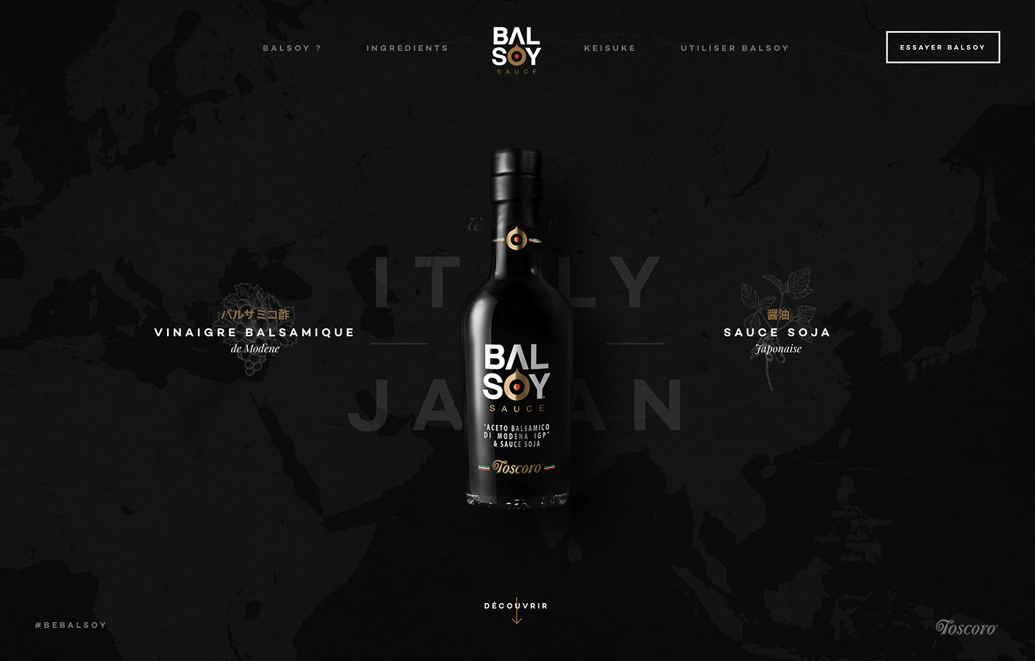
Balsoy proves that beauty and simplicity go hand-in-hand with their stunning one-page website. Clean lines and a modern design capture your attention from the start. Exploring the site is a pleasure thanks to smooth animations and clear visuals. Finding what you need is a breeze with their straightforward layout and simple navigation.
Balsoy is a perfect example of how a one-page website can be both attractive and user-friendly, creating a delightful experience for visitors.
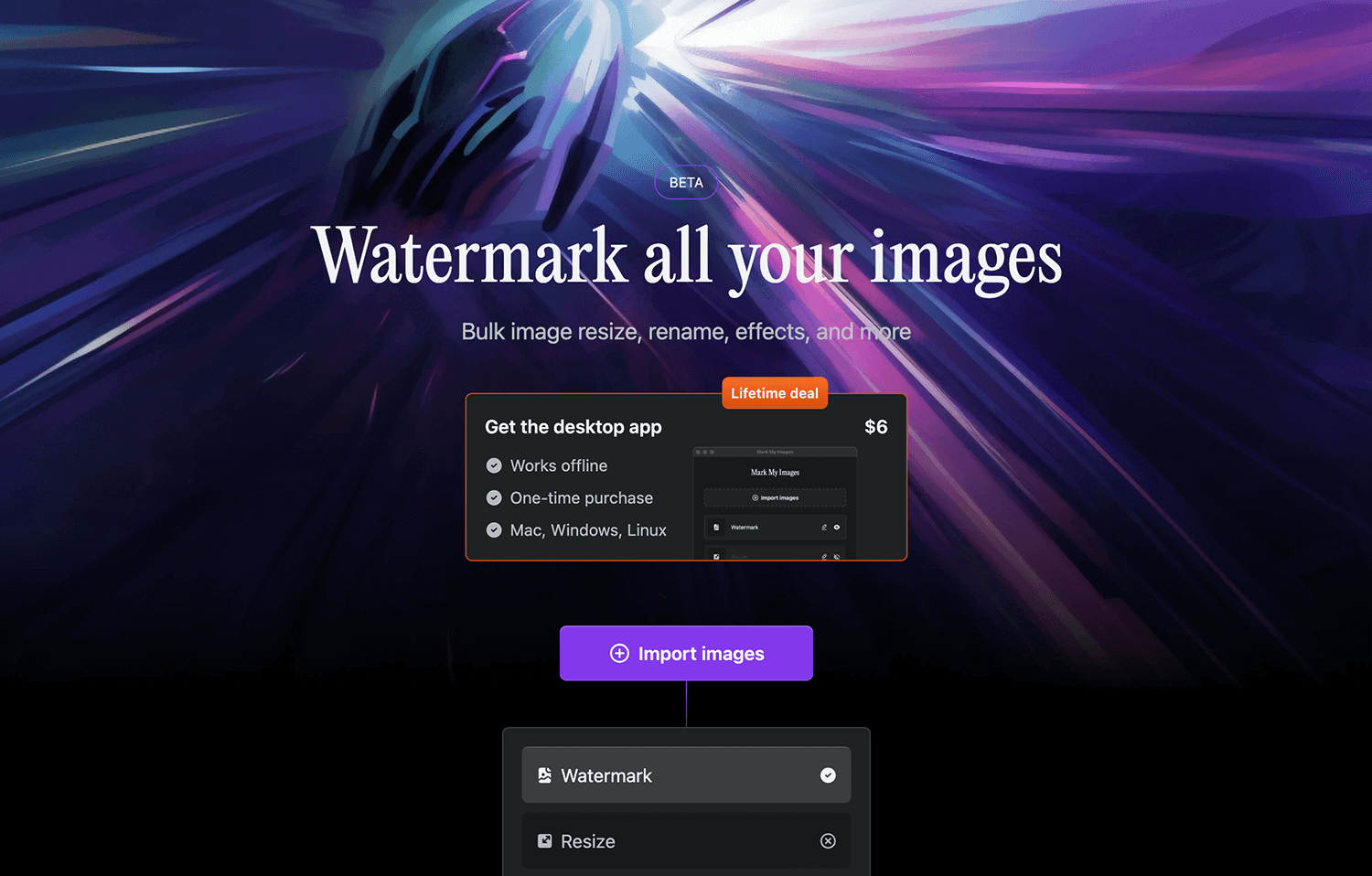
Mark My Images cuts straight to the chase with their one-page website. The design is clean and modern, making it easy to understand how their image watermarking service works. Smooth scrolling and clear visuals keep things engaging as you explore, while the simple layout and easy navigation ensure you can find the information you need in a flash.
Mark My Images is a perfect example of how a one-page website can be both functional and user-friendly, offering a hassle-free experience for visitors.
This single-page website example bursts with colorful pictures and smooth animations, making browsing a delight. Finding what you crave is simple with their clear layout and easy navigation. Whether you’re looking at the menu, scouting locations, or wanting to know their story,
Genesis proves a one-page website can be both informative and fun, making it a great example for restaurants considering this engaging design.

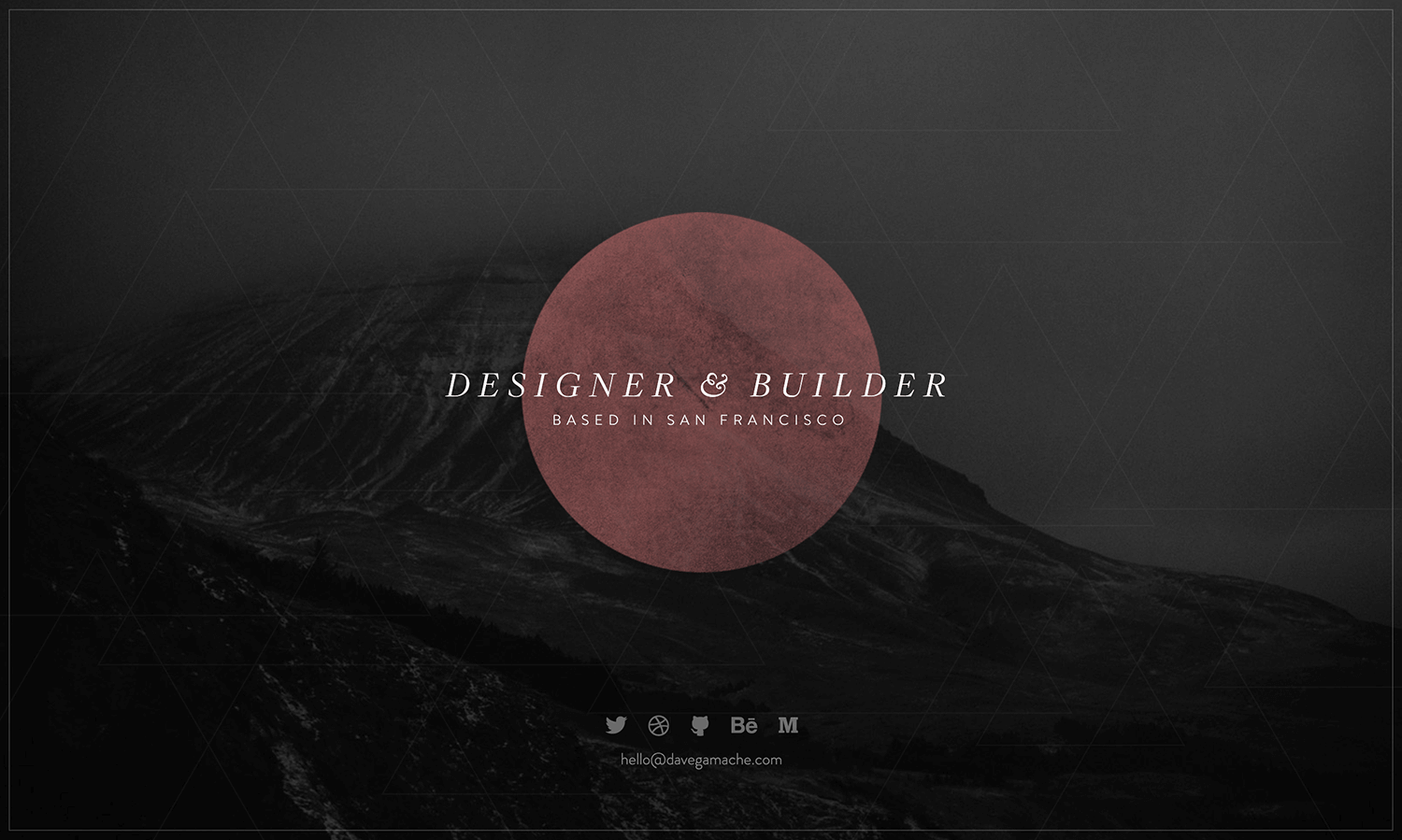
Our last example is Dave Gamache’s simple landing page. This one-page website is clean and easy to use, giving you all the key information at a glance.
The minimalist design and straightforward layout make navigation a breeze, showing how effective a simple one-page site can be. Dave Gamache’s page is a perfect example of “less is more” in web design.
Given that most websites are multi-page, here are 5 notable examples for reference:
- Justinmind – A detailed site with lots of navigation options..
- Apple – Product pages with lots of information.
- Amazon – A huge online store with many pages.
- Wikipedia – Lots of content across many pages.
- CNN – News site with frequently updated content across multiple pages.
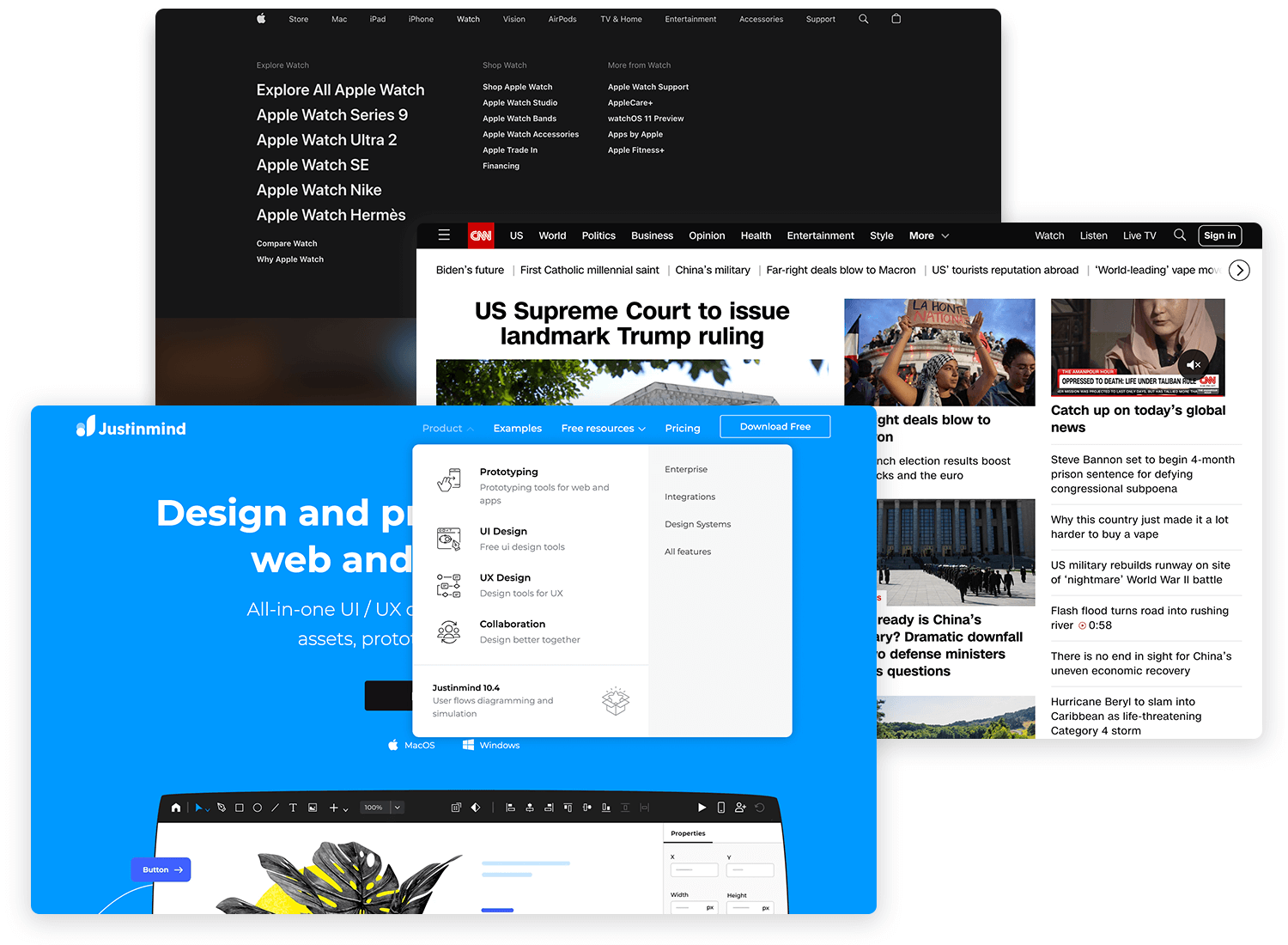
Most websites use a multi-page design because it allows for extensive content organization and better SEO opportunities.
We hope our post has shed some light on the differences between single and multi-page design. To sum up: single page design is great when you’ve got narrow focus or you’re encouraging users to perform a specific task. It’s also ideal for mobile-first design. On the other hand, multi-page design allows you to widen your reach potential, stick to traditional navigation systems and optimize your SEO strategy.
Single-page websites are perfect for keeping things simple and focused. They’re great for delivering a clear message and work really well on mobile devices. This makes them ideal for landing pages, portfolios, or events where you want users to take a specific action.
But, single-page sites do have some downsides. They can be harder to optimize for SEO and might not be the best choice if you need to keep adding lots of content over time.
Multi-page websites are great for handling lots of information and improving your SEO. They let you organize content across different pages, each targeting different keywords. This layout is familiar to most users, making it a reliable choice for businesses with lots of content.
However, multi-page sites can be more complex to design and maintain, and you need to ensure that users can easily find their way around.When determining whether to design a single-page vs multi-page website, there is no rule of thumb. The most important thing is to focus on your content. Think about what information you need to provide and how to make it as easy as possible for users to access. And if you’re still not sure, let your users decide!
PROTOTYPE · COMMUNICATE · VALIDATE
ALL-IN-ONE PROTOTYPING TOOL FOR WEB AND MOBILE APPS
Related Content
 UI design examples that bring some serious inspiration. From parallex scrolling to delicate animations - this list has it all to get you inspired!8 min Read
 The perfect web design portfolio is all about presenting yourself in the best light. Check out these guidelines, examples and practical templates!8 min Read
 Creating effective surveys is key to getting valuable feedback. This guide shows you how to plan your survey, write easy-to-answer questions, and design a user-friendly interface. We've covered everything from setting clear goals and knowing your audience to structuring questions and making the survey look so great that people will love to answer.23 min Read
